Most business cards are disposable.
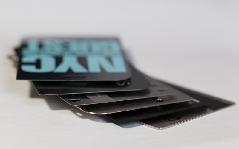
Metal cards aren’t.
That’s the whole game: you’re not just handing someone contact info, you’re handing them a physical argument that you’re credible.
Weight, finish, edge treatment, typography, and texture do something paper can’t do. They create a felt impression before anyone reads a single letter. And yes, people judge you for it. They just do.
Credibility, in the palm of someone else’s hand
A metal card doesn’t “look premium.” It behaves premium. It has inertia. It stays where you put it. It survives pockets, bags, and that one junk drawer everyone pretends they don’t have.
From a branding standpoint, that matters because perceived quality bleeds into perceived competence. There’s research behind this kind of “halo effect,” where one positive trait (like premium materials) influences how people judge everything else about you. One well-cited example is Nisbett and Wilson’s work on the halo effect in social judgments (1977), which has been used for decades in consumer perception discussions. Source: Nisbett, R. E., & Wilson, T. D. (1977). Journal of Personality and Social Psychology.
Now, this won’t apply to everyone, but: in industries where trust is the product, finance, luxury services, high-ticket consulting, real estate, a thoughtful metal card design can shorten the “are you legit?” phase. I’ve seen it turn an awkward first exchange into a confident second conversation, mostly because the other person keeps the card instead of losing it.
Thickness + finish: the two levers people feel immediately
Look, you can botch this fast.
Go too thin and it feels like a novelty. Go too thick and it feels like you’re trying to compensate. (Yes, people will think that, even if they don’t say it.)
A practical way to think about thickness is: enough rigidity that it doesn’t flex, but not so much that it feels like a metal bookmark. If you’re choosing between two options and one feels slightly heavier in hand, that’s often the one that reads “serious” without reading “gimmick.”
Finishes are where the personality shows up:
– Brushed metal: modern, industrial, confident. Also hides fingerprints better than glossy.
– Polished/chrome: loud luxury. High shine, high risk (glare is real).
– Matte: quieter, more expensive-feeling than people expect, and usually the most readable under harsh lighting.
– Dual finish (matte field + polished accents): high-end when done with restraint; messy when overused.
One specialist note: reflective finishes can destroy legibility under point lighting (conference halls, hotel lobbies, restaurants). If your card is likely to be read under spotlights, polished may fight you.
A slightly informal heading: don’t ruin it with bad type
You’d be surprised how many gorgeous metal cards are basically unreadable.
Metal introduces glare, micro-reflections, and sometimes physical depth (engrave/deboss/emboss). All of that punishes delicate typography. Hairlines disappear. Ultra-light weights turn into ghosts. Tight tracking becomes a shimmering blur at an angle.
So design like you’re designing signage, not stationery.
Quick hierarchy that works in 3D
Name and role should win instantly. Everything else follows.
Try this structure:
– Primary line: Name (largest, high contrast)
– Secondary line: Title / company (smaller but still strong)
– Tertiary block: phone/email/site (clean, spaced, never cramped)
– Optional: QR or icon row (small, but not “microscopic”)
Here’s the thing: negative space is your friend on metal. Paper lets you cram. Metal punishes it. Give the content room to breathe and it will look more expensive, not less “efficient.”
And please, test it under real lighting. Not just in a perfect mockup. Tilt it. Step back. Check it at arm’s length.
Texture is not decoration. It’s memory.
Embossing, debossing, etching, microtexture, these aren’t “nice touches.” They’re behavioral triggers. People run their thumb over raised elements without thinking. That extra second of contact is branding time you didn’t have to ask for.
I’m opinionated on this: one tactile hero moment beats five small tricks.
Examples of tactile “hero” moves that actually land:
– Deep engraved logo with clean edges (crisp beats complex)
– Microtexture background that contrasts with smooth text zones
– Edge treatments that feel intentional: chamfer, bevel, or a sharp modern edge depending on your brand voice
– Spot polish used like punctuation, not like confetti
Consistency matters too. If emboss depth varies from card to card, it reads as sloppy. People may not articulate it, but they’ll feel it.
One-line emphasis, because it’s true:
A metal card should reward touch, not demand attention.
If your card doesn’t match your brand story, don’t print it.
That’s not being dramatic. It’s practical.
A heritage brand printing a futuristic chrome slab with techno fonts looks confused. A cutting-edge startup handing out antique-looking brass with ornate flourishes feels like cosplay. The material language has to match the narrative language.
A few translation cues (steal these):
If your story is innovation
– cooler metals, sharper edges
– minimalist layouts, high precision engraving
– restrained palette, high contrast
If your story is heritage
– warmer metals (brass/bronze tones)
– classic typography, slightly softer edge treatments
– subtle patina-like finishes (tastefully, not fake-grungy)
If your story is discreet luxury
– matte finishes, low-gloss everything
– tone-on-tone branding
– small but perfect details (this is where microtexture shines)
Brand consistency isn’t just logos and colors; it’s the behavior of the object. Does it feel bold? Quiet? Exacting? Rugged? That should be aligned with how you sell, how you speak, and what you promise.
A few practical “don’t regret it later” checks
Not glamorous, but they save you from expensive reprints.
– Glare test: read it under downlights and near a window.
– Pocket test: put it in jeans for a day. Check scratches and edge wear.
– Smudge test: handle it with slightly oily hands (real life happens).
– Scan test: if there’s a QR code, scan it in dim light and at angles.
– Contrast audit: if you squint and the text disappears, it’s not high enough contrast.
Now, this won’t apply to everyone, but if your audience is older or your card gets read in low-light venues, prioritize legibility over subtlety. Subtlety is only impressive when it’s still functional.
The point: design it like a product, not a flyer
A metal card is a micro-product. It has industrial design, ergonomics, durability, and sensory UX baked into it. Treat it that way and you get something that doesn’t just “stand out”, it sticks around, which is the only kind of memorability that actually converts into follow-ups.
And when someone pulls it out again later, it should still feel like you.